

Since 2001, Justicia for Migrant Workers has been organizing alongside agricultural workers to demand fair treatment and challenge an exploitative immigration system.

In reimagining their visual identity, we wanted to centre the workers themselves — their strength, resilience, and everyday realities. The new icon depicts a worker in the field wearing a double bandana — a common way to protect against sun, dust, and pesticides.
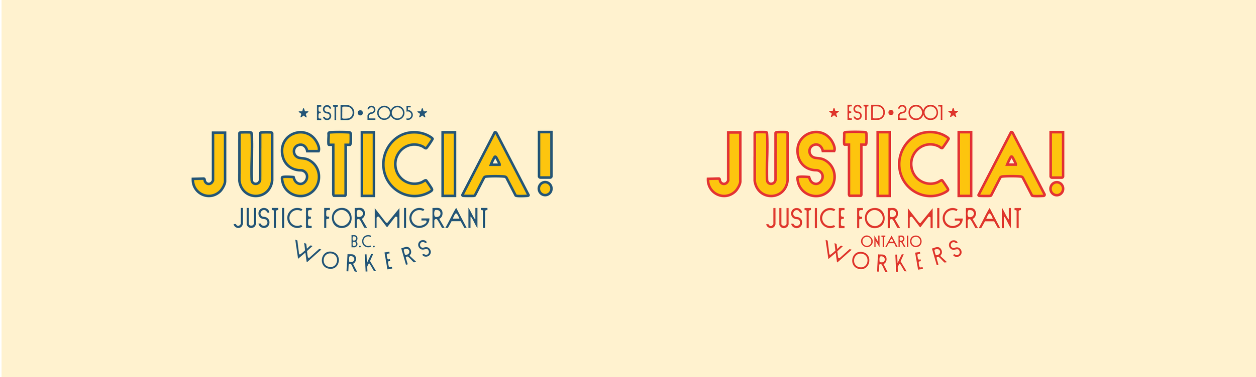
Justicia! operates in both Ontario and B.C., so the brand system needed to feel cohesive while giving each chapter room for its own identity. Both branches share the same core icon, keeping the organization visually united, and differentiate themselves through colour.
B.C.’s palette draws from shades of blue, referencing blueberries — the province’s largest agricultural export. Ontario uses a warm red tone inspired by tomatoes, a staple crop in that region.


The new logo takes inspiration from the small produce stickers found on fruits and vegetables — a subtle reminder of the invisible labour behind our food systems. By echoing this familiar form, the identity connects directly to the agricultural work at the heart of Justicia!’s mission, making the logo feel both approachable and instantly contextual.

Thank you to the Justicia! Justice for Migrant Workers team for inviting me to collaborate on this important project.