
Vancouver Sustenance Festival
Client: City of Vancouver - Vancouver Parks Board
Sector: Municipal Government
Service: Branding, project narrative and copywriting

The Vancouver Sustenance Festival is a city-wide platform in Vancouver celebrating land and food through public workshops and events. The goal: to create a recognizable brand identity that reflects its values of food justice, Indigenous sovereignty, and sustainability. Using the City of Vancouver’s colours alongside a custom palette, the identity balances civic familiarity with a fresh, welcoming spirit — giving the festival a clear and flexible voice.
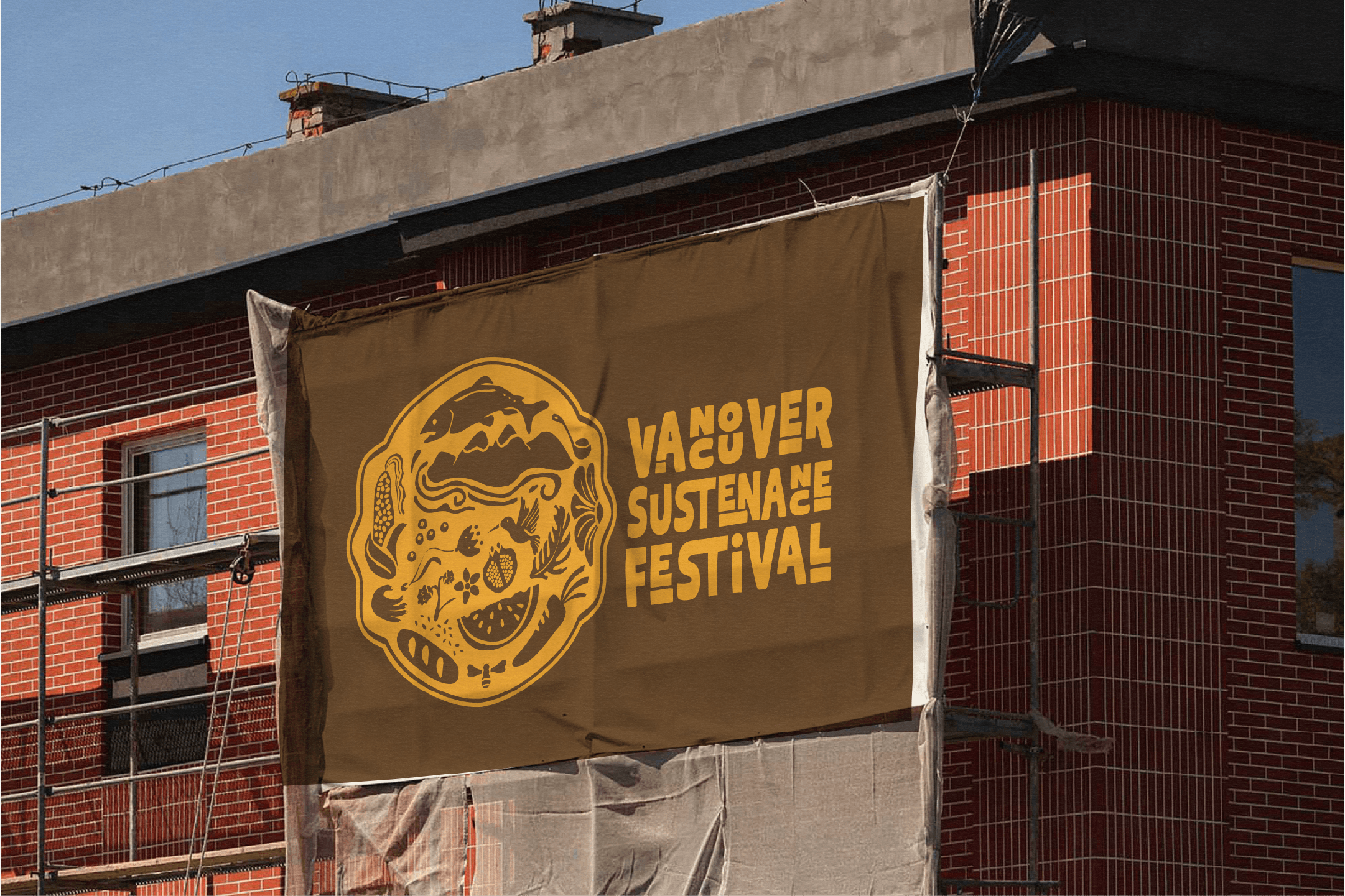
The visual identity draws on hand-drawn illustrations of culturally significant foods and natural elements — from fish, corn, watermelon, and pomegranate to hummingbirds, flowers, seeds, bees, and bread. With no hierarchy between elements, the system reflects the interconnectedness of food, culture, and land. A custom hand-drawn typeface echoes the organic forms and textures of the festival, while a palette of forest green, harvest yellow, and earth brown grounds the brand in themes of growth, abundance, and sustainability.
It was important to design a flexible logo family that could adapt across scales and contexts, from small digital applications to large-format signage. The illustrated elements can be deconstructed into wayfinding, posters, and other materials, creating a cohesive and recognizable visual language. This flexibility ensures the festival’s presence feels unified while allowing room for playful expression across the city.
This project was done in collaboration with Mare Verso Creative